



Pick the wrong question type and no amount of clever wording will save the data. Ask an open-ended “What could we improve?” when you needed a number to trend over time, and you end up with 400 comments and no metric. Ask a 1 to 5 rating when you needed the reason behind a cancellation, and you get a tidy average that explains nothing. Most survey mistakes trace back to this one thing: the format was wrong for the decision, not the sentence. So this guide is the catalog. Every common question type, what it gives you back, when to reach for it, when to skip it, and a rendered example of each so you can see exactly what the respondent sees.
Key Takeaways
- Two axes decide every question: open-ended vs closed-ended (the structure) and qualitative vs quantitative (the data you get back). Sort your question by those first, then pick a format.
- The catalog exists so you can match the type to the decision. Closed types give you countable numbers; open types give you the “why.” Reaching for the wrong one is the most common survey error we see.
- When you need a comparable number you can track over time and benchmark against others, use a standardized metric type: NPS for loyalty, CSAT for satisfaction, CES for effort. These are purpose-built question formats with fixed scoring.
- Route each type to its deep dive. This page is the map, not the whole territory.
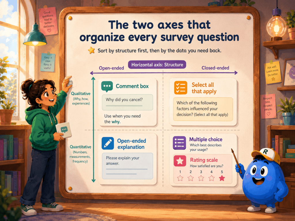
The two axes that organize every survey question
Before you pick a format, place your question on two axes.
The first is structure: open-ended vs closed-ended. Closed-ended questions give the respondent a fixed set of answers to choose from, so the output is countable. Open-ended questions hand them a blank box, so the output is language.
The second is the data you get back: qualitative vs quantitative. Quantitative answers are numbers you can average, segment, and chart. Qualitative answers are themes you have to read and interpret. The two usually line up (closed produces quantitative, open produces qualitative), but not always: a “select all that apply” list is closed yet often analyzed as categories, not scores.
Sort your question by those two axes first. If you need a number to trend, you are in closed and quantitative. If you need the reason behind that number, you want a qualitative question. Everything below is a concrete format sitting under one of those families.
Closed-ended question types (quantitative)
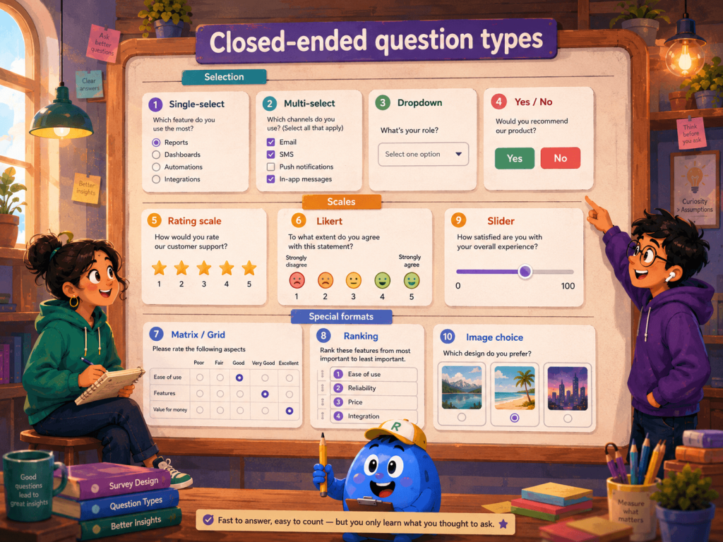
Closed-ended questions are the workhorses of any survey. They constrain the answer to options you define, which makes them fast for the respondent and trivial to analyze at scale. The trade-off is that you only learn what you thought to ask. Here are the formats worth knowing, each with a rendered example.
Multiple choice, single-select
The respondent picks exactly one option from a list. It is the default closed question: clean to read, clean to count, and it forces a single answer where a single answer is the truth.
Which feature made you choose us? ◯ Reporting ◯ Integrations ◯ Pricing ◯ Support
Use it when the options are known and mutually exclusive, like plan tier or primary use case. Avoid it when a respondent could honestly pick two, or when the real answer might not be on your list (add an “Other” field for that). For the full build, see multiple choice questions.
Multiple choice, multi-select (checkbox)
Same list, but the respondent can tick more than one box. The data comes back as counts per option rather than a single distribution, so read it as “how common is each,” not “which won.”
Which integrations do you use? (select all that apply) ☐ Shopify ☐ HubSpot ☐ Slack ☐ Zapier
Reach for checkboxes when real behavior is “several of these,” like tools in a stack or reasons for a purchase. Skip it when you actually need a single priority, since a pile of ticks hides which one matters most. That is a ranking question’s job.
Dropdown / select
A dropdown is a single-select list collapsed behind a menu. Functionally it is multiple choice; the only difference is presentation, and that difference matters when the list is long.
What industry are you in? ▾ Select one (Retail, SaaS, Healthcare, Manufacturing, Finance, Education, … 20+ more)
Use it for long, familiar lists such as country, industry, or plan, where showing every option as a radio button would flood the screen. Avoid it for short lists (three or four options), where visible radio buttons are faster and get higher completion.
Dichotomous (yes/no, true/false)
A two-option question. It is the fastest thing you can ask and the easiest to chart, which is exactly why it gets overused.
Did you find what you were looking for today? ◯ Yes ◯ No
A dichotomous question is perfect as a gate or a filter: did the order arrive, is the person a customer, yes or no. It falls apart the moment the honest answer is “sort of.” When the truth lives in the middle, a scale will tell you far more than a binary ever can.
Rating scale (numeric or star)
A rating scale asks for a single number on a fixed range, often 1 to 5 or 1 to 10, or the same idea rendered as stars. It is the quickest way to capture intensity: not just whether someone liked something, but how much.
How would you rate your delivery experience? ★ ★ ★ ★ ★
Use it for quick satisfaction snapshots after a specific interaction; the star variant is covered in our 5-star rating survey guide. Avoid treating a raw average as comparable across time (except when the question and scale stay identical) or against other companies, because your 4.2 and someone else’s are measured differently. When you need that comparability, use a standardized metric below.
Likert scale
Named after psychologist Rensis Likert, who introduced it in 1932, this scale measures agreement with a statement across ordered points, usually five or seven. It captures direction and strength in one question, which makes it the standard for attitude and perception research.
“The dashboard gives me the reports I need.” Strongly disagree · Disagree · Neutral · Agree · Strongly agree
Use it to measure how strongly people hold a view, capturing degree rather than a bare yes or no. Keep the scale balanced (equal positive and negative points) and label every point. It is a specialized enough format that we keep the full method, including the neutral-midpoint debate, in a dedicated 5-point Likert scale guide rather than rebuilding it here.
Semantic differential
A bipolar scale anchored by two opposite adjectives, with unlabeled points in between. Almost nobody includes it in a survey-type list, which is a shame, because it is the cleanest way to measure perception between two poles.
How would you describe our onboarding? Confusing ◯ ◯ ◯ ◯ ◯ ◯ ◯ Intuitive
Introduced by psychologist Charles Osgood in 1957, it works well for brand and experience perception (cheap to premium, slow to fast, cold to friendly). Use it when the thing you are measuring naturally lives on a spectrum between two words. Avoid it when the two poles are not genuine opposites, since respondents will not know where to land.
Matrix / grid
A matrix rates several items against the same scale in one compact block. It saves space and keeps the respondent in one mental mode.
How satisfied are you with each area?
| Very dissatisfied | Dissatisfied | Neutral | Satisfied | Very satisfied | |
|---|---|---|---|---|---|
| Onboarding | ◯ | ◯ | ◯ | ◯ | ◯ |
| Support | ◯ | ◯ | ◯ | ◯ | ◯ |
| Pricing | ◯ | ◯ | ◯ | ◯ | ◯ |
Use it when you are rating a handful of related items on one consistent scale. The catch is fatigue: long grids collapse on mobile and invite straight-lining, where people click the same column down the page. Keep rows few and the scale short.
Ranking
A ranking question makes respondents order options by preference, forcing the trade-offs that a checkbox lets them dodge. Competitors tend to describe ranking without ever showing one, so here is the rendered version.
Drag to rank what matters most when you choose a checkout (1 = most important): ⇅ 1. Checkout speed ⇅ 2. Guest checkout ⇅ 3. Payment options ⇅ 4. Saved shipping details
Use it when you need priorities rather than a flat list of things people like. Everything cannot be number one, and that is the point. Keep the set short (six items or fewer); past that, respondents rank the top two honestly and guess the rest.
Slider
A slider is a rating scale the respondent drags along a track. Same underlying data as a numeric scale, with a more tactile, playful feel.
How likely are you to reorder this month? 0 ├────────●───────┤ 100
Sliders can lift engagement in consumer surveys. The downside is precision: the default handle position biases answers, and the fine granularity is usually false comfort. When you need clean, comparable numbers, a labeled scale beats a slider.
Image choice
Image choice swaps text options for pictures. The respondent picks a visual instead of reading a label.
Which packaging design do you prefer? [ Design A ] [ Design B ] [ Design C ]
It shines for design tests, product preference, and low-literacy or cross-language audiences where a picture carries the meaning faster than words. Avoid it when the options are genuinely abstract, since forcing an image onto a non-visual choice just adds noise.
Standardized CX-metric question types
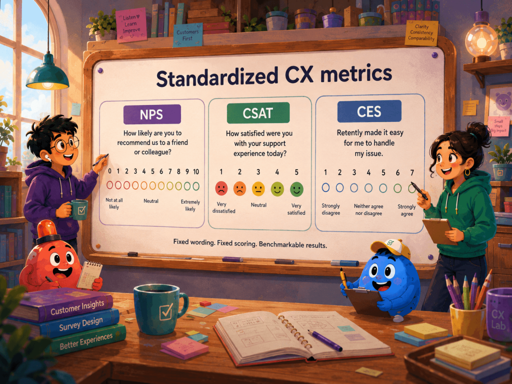
Here is the block most survey guides skip. NPS, CSAT, and CES are not vague categories; they are specific closed-question formats built around standardized scoring and wording. That fixed scoring is the whole point: it makes the number comparable across time, across teams, and against industry benchmarks in a way a homegrown 1 to 5 never is. We render all three inside Retently, so the examples below match how the question actually reaches a customer.
Net Promoter Score (NPS)
NPS asks one loyalty question on a 0 to 10 scale.
How likely are you to recommend Retently to a friend or colleague? 0 1 2 3 4 5 6 7 8 9 10 (0 = not at all likely, 10 = extremely likely)
Responses split into Promoters (9-10), Passives (7-8), and Detractors (0-6). The score is the percentage of Promoters minus the percentage of Detractors, which lands somewhere between -100 and 100. Use it to track relationship health and loyalty over time. Introduced by Fred Reichheld in 2003, it has become the standard loyalty benchmark; the full method lives in our guide to the Net Promoter Score, and you can start from ready-made NPS templates.
Customer Satisfaction (CSAT)
CSAT measures satisfaction with a specific experience, usually on a 1 to 5 scale.
How satisfied were you with your support experience today? 1 · 2 · 3 · 4 · 5 (1 = very dissatisfied, 5 = very satisfied)
The score is typically expressed as the percentage of respondents who picked the top boxes (the satisfied ratings – 4 or 5) out of all responses, which keeps it comparable to benchmarks. Gorgias, for example, calculates CSAT this way. Use it right after a touchpoint, a support ticket, a delivery, an onboarding step, when you want a quick read on that moment. See CSAT for the calculation details.
Customer Effort Score (CES)
CES measures how hard it was to get something done, phrased as agreement with a statement on a 1 to 7 scale.
“Retently made it easy for me to handle my issue.” Strongly disagree · 1 2 3 4 5 6 7 · Strongly agree
Score it by taking the share of respondents who answered 5 to 7 (the agreement end). Low effort is a strong predictor of loyalty, which is why CES fits transactional moments like checkout, self-service, or a support resolution. The full method is in our Customer Effort Score guide.
Open-ended question types (qualitative)
Everything so far produces numbers. Open-ended questions produce language, and that is their entire value: they tell you the “why” behind a rating that a scale can only hint at.
Open-ended / comment box
The respondent types a free-text answer. No options, no scale, just a blank field.
What almost stopped you from completing your purchase? [ your answer ]
The reason an open box beats a closed list here is that you often cannot predict the answers. A DTC store running this after checkout surfaces objections nobody on the team had listed: sizing doubt, a slow shipping estimate, a coupon that would not apply. The trade-off is analysis. Rich themes are harder to quantify than a tidy average, and a thousand comments do not summarize themselves. Keep open questions few and pointed, pair them with a closed question for the number, and lean on tooling to read the pile at scale. For depth on when open beats closed, see our open-ended question examples.
Demographic and screening questions
Demographic and screening questions are usually closed in format, but they earn their own category because their purpose is different: they describe who the respondent is and decide who qualifies, rather than measuring an experience.
What is your company size? ◯ 1-10 ◯ 11-50 ◯ 51-200 ◯ 201-1,000 ◯ 1,000+
Screening questions gate the survey (only current customers, only people who used the new feature). Demographic questions let you slice the results afterward by segment. The best-practice one-liner: ask them last, keep them optional, and only ask what you will actually use to filter or compare. Leading with intrusive profile questions is a reliable way to lose the respondent before the questions that matter. Our demographic questions guide has the full set.
How to choose the right question type
Everything above condenses into one decision: match the format to the data the decision needs. Read the table by the middle columns. Find the job you are trying to do, then take the type on that row.
| Type | Data you get | Best for | Avoid when |
|---|---|---|---|
| Multiple choice (single) | Quantitative | One clear pick from a known set | The real answer may not be listed |
| Checkbox (multi-select) | Quantitative | “Select all that apply” behavior | You need a single priority |
| Dropdown | Quantitative | Long, familiar lists | Short lists you want visible |
| Dichotomous | Quantitative | A clean yes/no gate | The truth lives in the middle |
| Rating scale | Quantitative | Quick intensity snapshots | You need cross-company comparability |
| Likert | Quantitative | Attitude and agreement strength | A yes/no would do |
| Semantic differential | Quantitative | Perception between two poles | The poles are not true opposites |
| Matrix / grid | Quantitative | Rating many items on one scale | Long lists, mobile respondents |
| Ranking | Quantitative | Forcing trade-offs and priorities | More than six items |
| Slider | Quantitative | Playful, continuous scales | You need precise, comparable data |
| Image choice | Quantitative | Visual or cross-language choices | Options are abstract |
| NPS (0-10) | Quantitative, benchmarkable | Loyalty tracked over time | One-off transactional detail |
| CSAT (1-5) | Quantitative, benchmarkable | Satisfaction after a touchpoint | Long-term loyalty |
| CES (1-7) | Quantitative, benchmarkable | Effort at a specific interaction | Overall relationship health |
| Open-ended | Qualitative | The “why” behind a number | Anything you need to trend at scale |
| Demographic | Quantitative (classification) | Segmenting and filtering results | Early in the survey; intrusive fields |
Common pitfalls when mixing question types
The failure mode is rarely one bad word. It is a format that fights the decision.
Type-format mismatch. Asking for a number when you need a theme, or a theme when you need a number, is the most common error we see across Retently accounts. If the plan is to trend the answer month over month, a comment box will not get you there; if the goal is to understand a spike in cancellations, a 1 to 5 rating never will. Decide what you will do with the answer, then pick the type.
Overusing the matrix. Grids are tempting because they pack ten questions into one screen. They also produce the most straight-lining and the steepest mobile drop-off. If a matrix has more than a handful of rows, split it or cut it.
Double-barreled options. A single option that bundles two ideas (“fast and friendly support” or asking “Was the food and service good?”) cannot be answered cleanly, because a respondent might mean one and not the other. Keep each option to one idea, the same way you keep each question to one idea. The full checklist is in how to write good survey questions.
Leading option sets. Even a neutral question goes biased if the answer choices tilt the scale, four positive options and one negative, or a list that plants the conclusion you want. Balanced options are as important as neutral wording. We cover the wording side in the guide on avoiding leading questions.
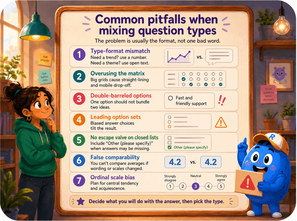
Picking the right type is only half the job – a few other pitfalls show up just as often in how that type gets built, scored, or placed:
No escape valve on closed lists. A single-select or checkbox list with no “Other” field assumes you already know every answer a respondent could give. When the real answer isn’t on the list, people either pick the closest wrong option or abandon the question, and both outcomes quietly corrupt the data. Any closed list built from a guess rather than prior research needs an “Other (please specify)” option.
Treating raw averages as comparable when they aren’t. A 4.2 out of 5 means nothing next to another team’s 4.2 unless the question wording, the scale length, and the labels are identical. The same goes for tracking your own average over time after you’ve changed the scale or the phrasing. Comparability has to be built in at the question-design stage; it can’t be recovered afterward by just reading two numbers side by side.
Picking an ordinal scale without planning for how people actually answer it. Likert and rating scales are vulnerable to central tendency (respondents cluster on the neutral midpoint to avoid committing) and acquiescence bias (respondents default to “agree” regardless of what they think). Neither is a respondent flaw to correct after the fact. Both are reasons to keep statements short, unambiguous, and balanced at the design stage.
Conclusion
The catalog is long, but the job it does is simple. Every type is a different bargain between how much you constrain the answer and how much you learn. Closed types buy you clean, countable data at the cost of nuance. Open types buy you nuance at the cost of easy analysis. The standardized metric types buy you comparability by fixing the wording and the math. Start with the decision, place the question on the two axes, then take the format that fits.
Retently is built for the part most tools treat as an afterthought: running NPS, CSAT, and CES as first-class question types, rendered correctly and scored the standard way, so the number you get is one you can actually benchmark and trend. Browse the ready-made survey templates to see the metric types in context, or start a free trial to send one to your own customers.
Frequently Asked Questions
What are the main types of survey questions? At the top level, survey questions are either closed-ended (fixed answer options, easy to count) or open-ended (free text, rich to read). Underneath those sit the concrete formats: multiple choice, dropdown, dichotomous, rating scale, Likert, semantic differential, matrix, ranking, slider, and image choice on the closed side, plus the comment box on the open side.
What is the difference between open-ended and closed-ended questions? Closed-ended questions give the respondent a set list to choose from, so the output is countable numbers you can chart and segment. Open-ended questions give a blank box, so the output is language you have to read and interpret. Closed tells you what and how many; open tells you why. Most good surveys use closed for the metric and one open question for the reason.
What are quantitative survey questions? Quantitative survey questions produce numeric data you can average, compare, and track over time. That covers every closed format that outputs a value: ratings, Likert scales, dichotomous yes/no, ranking, sliders, and standardized metrics like NPS, CSAT, and CES. If the answer can be counted or scored rather than read, the question is quantitative.
What is a dichotomous question? A dichotomous question offers exactly two answer options, usually yes/no or true/false. It is the simplest closed question and the fastest to analyze, which makes it ideal as a gate or filter (“Are you a current customer?”). Its weakness is nuance: when the honest answer is “somewhat,” a rating scale captures far more than a binary can.
Which survey question type gets the best response rate? Single-question closed formats generally see the highest completion, because they cost the respondent almost no effort. A one-tap NPS, CSAT, or dichotomous question typically outperforms a long grid or a stack of open-ended prompts. The reliable lever is not a magic type but low effort overall: fewer questions, closed where you can, one open question at most.

 Christina Sol