



A pricing meeting usually ends with someone saying a number out loud. The team nods, the deck gets updated, and a price that will shape revenue for the next two years gets set on the strength of a hunch and a glance at what competitors charge. Nobody in the room actually knows what customers would have paid.
That gap is expensive in both directions. Price too low, and you leave margin on the table for every deal you close. Price too high, and you never see the customers who quietly bounce off the pricing page. McKinsey’s pricing research puts hard numbers on the upside: for the average S&P 1500 company, a 1% improvement in price lifts operating profit by 8%, assuming volume holds. Few other levers move profit that much for that little effort.
Willingness to pay is the number that tells you where that line sits. The good news is that you do not have to guess at it. You can measure it with surveys, and you can read early signals in the feedback you already collect. This guide covers both: the four survey methods that actually work, the exact questions to ask, how to read the results, and where each method quietly falls apart.
Key Takeaways
- Willingness to pay (WTP) is the maximum a customer would pay for your product before they walk away. Treat it as a range across your market, not a single magic number.
- Asking “what would you pay?” straight out inflates the answer. People overstate hypothetical spending, so serious pricing work uses structured methods instead.
- Three survey methods do the heavy lifting: Van Westendorp for an acceptable price range, Gabor-Granger for demand and revenue curves, and conjoint analysis for what specific features are worth.
- Sample size and segmentation decide whether the data is usable. Aim for at least ~100 responses per segment you plan to analyze, and screen for people who would realistically buy.
- Before you commission a formal study, your existing NPS, CSAT, feature requests, and cancellation reasons already hint at where WTP sits by segment. That signal is free and continuous.
What Is Willingness to Pay?
Willingness to pay is the maximum price at or below which a customer will buy one unit of a product. Charge a cent more than someone’s WTP and, in theory, they walk. Charge less and you have handed them consumer surplus, the difference between what they would have paid and what you actually asked for.
Two things make WTP slippery in practice.
First, it is not one number. Every customer has their own ceiling, so what you really have is a distribution across your market. A price is a decision about how much of that distribution you want to convert. Set it near the top, and you win high-value buyers and lose volume. Set it near the bottom, and you fill the funnel, but cap your revenue per customer. Thinking in ranges rather than a single figure is the difference between a pricing strategy and a lucky guess.
Second, WTP is context-sensitive. The same person will pay more for a cold drink at a beach bar than at a corner shop, for the identical bottle, because the setting changes what the purchase is worth to them. For software, context shows up as the problem being solved, the urgency behind it, and the alternatives on the table. Move any of those and the number moves with it.
You will also see the term marginal willingness to pay, which is the extra a customer would pay for one more unit or one more feature. It matters because most pricing questions are not “buy or not” but “is this tier, this add-on, this seat count worth the jump?” Conjoint analysis, later in this guide, is built to answer exactly that.
One neighboring concept worth separating out: willingness to accept (WTA), the smallest amount someone would take to give up a good or put up with something they would rather avoid. WTP and WTA are mirror images, and they rarely match. Research on the endowment effect keeps finding that people demand more to part with something than they would pay to get the same thing (the classic evidence is Kahneman, Knetsch and Thaler’s experiments). For pricing a product you are selling, WTP is the number you want.
What Actually Moves Willingness to Pay
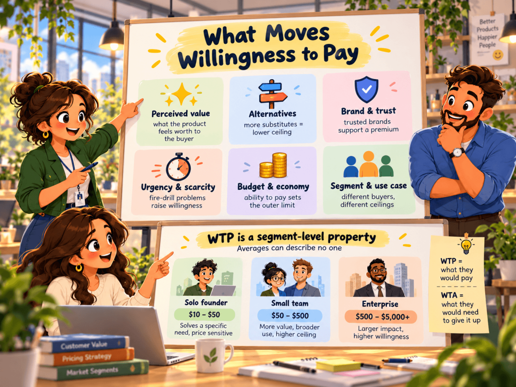
Before you measure WTP, it helps to know what you are measuring, because the same customer’s ceiling shifts with the factors below. These are the levers that show up most consistently in pricing research.
- Perceived value. Not the cost of building the product, but how much the buyer believes it is worth to them. This is why two tools with near-identical feature lists can command very different prices. It also ties directly to satisfaction: we have written before about how your pricing shapes customer satisfaction, and the same perception that supports a price also protects retention.
- Available alternatives. WTP is always relative to the next-best option. A crowded category with free tools drags the ceiling down. A product with no real substitute pushes it up.
- Brand and trust. A known, trusted brand carries a price premium because it lowers the buyer’s perceived risk. New entrants pay for that trust in discounts until they earn it.
- Urgency and scarcity. A problem that is on fire right now supports a higher price than a nice-to-have. Genuine scarcity, real capacity limits, or time-boxed availability does the same.
- Budget and the economy. WTP is bounded by what the buyer can actually spend. In a tight budget cycle, the ceiling drops even when perceived value has not.
- Segment and use case. An enterprise team and a solo founder can look at the identical product and land on wildly different numbers. This is why measuring WTP for “the market” as a single blob usually yields a mushy average that describes no one.
That last point is the one people skip, and it is the one that matters most. WTP is a segment-level property. Measure it as an average and you optimize for a customer who does not exist.
Why You Cannot Just Ask
The obvious move is to put “How much would you pay for this?” in a survey and read the answers. It is also the move that produces the least reliable data you will collect all year.
Hypothetical spending is cheap. When there is no real money on the line, people answer with the version of themselves they would like to be: a little more generous, a little less price-sensitive than they act at checkout. The number drifts up. Ask the question with your logo on the page and it drifts further, because now the polite answer and the honest answer diverge. A meta-analysis comparing stated and real willingness to pay found that hypothetical answers overshoot real ones by about 21% on average. Treat that as a reference point, not a rule.
This does not make direct questions useless, but it does mean you cannot take a raw “I’d pay $50” at face value. The methods below exist precisely to get around this problem, either by changing what you ask (Van Westendorp asks about price perception, not a commitment) or by forcing a trade-off that behaves more like a real purchase (conjoint). Understanding the weakness is what tells you which method to trust for which decision.
How to Measure Willingness to Pay With Surveys
There are four survey approaches worth knowing, in rough order of simplicity. Pick based on the decision you are trying to make and how much rigor it deserves, not on which one is fanciest.
Whichever you choose, describe what is being priced the way you will sell it: the product, what is included, the unit (per seat, per contact), the billing period, and the realistic alternatives. Without that, every respondent prices a different product.
1. The direct question (and why it still has a place)
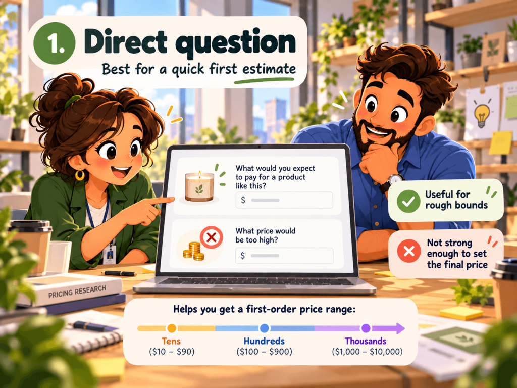
The simplest method asks people, in one form or another, what they would pay. A cleaner version is the open “What would you expect to pay for a product like this?” paired with a “What price would be too high?” follow-up.
Because of the hypothetical-bias problem above, treat direct answers as a rough triage, not a pricing decision. They are genuinely useful for one thing: getting a first-order-of-magnitude read when you have no idea whether customers are thinking in tens, hundreds, or thousands. Use it to bound the problem, then reach for a structured method to actually set the number. If you are wiring these into a live survey, our survey question templates show how to phrase and sequence them so you do not lead the respondent.
2. Van Westendorp Price Sensitivity Meter
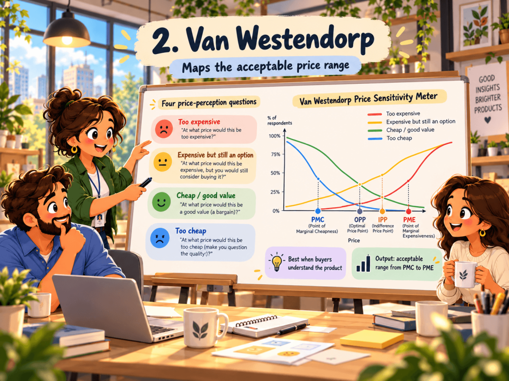
The Van Westendorp Price Sensitivity Meter, introduced by the Dutch economist Peter van Westendorp in 1976, sidesteps the commitment problem by asking about price perception instead of a purchase promise. Respondents see four questions, each asking for a price, not a yes or no:
- At what price would you consider the product to be so expensive that you would not consider buying it? (too expensive)
- At what price would you consider the product starting to get expensive, so that it is not out of the question, but you would have to give it some thought? (expensive, but still an option)
- At what price would you consider the product to be a bargain, a great buy for the money? (cheap / good value)
- At what price would you consider the product priced so low that you would question its quality? (too cheap)
Plot the cumulative responses to all four as curves, with price on the x-axis, and their intersections hand you four reference points:
- Optimal Price Point (OPP) – where “too cheap” crosses “too expensive.” At this price the fewest people reject the product on price grounds in either direction. Note that “optimal” here means least resistance, not maximum revenue.
- Indifference Price Point (IPP) – where “expensive” crosses “cheap.” Roughly the point where as many people call it expensive as call it a bargain, is often read as the price the market considers normal.
- Point of Marginal Cheapness (PMC) – where “too cheap” crosses “expensive” – the floor. Go below it and you start losing buyers who assume the low price signals low quality.
- Point of Marginal Expensiveness (PME) – where “too expensive” crosses “cheap” – the ceiling. Go above it and you lose buyers who simply find it too dear.
PMC to PME is your acceptable price range. A narrow band means a price-sensitive market where small moves cost you buyers; a wide band gives you room to maneuver.
Van Westendorp is popular because the questions are easy to answer and the output maps cleanly onto a real decision. Where it breaks: it works best when respondents already understand the product, so it struggles with genuinely new or complex offerings where people have no reference price. And some datasets never produce a clean OPP at all. Price a category with a very low floor and a very high ceiling, and the “too cheap” and “too expensive” curves may never cross. Treat the four points as a guide, not gospel.
3. Gabor-Granger
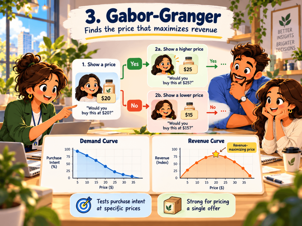
The Gabor-Granger method, developed by economists Clive Granger and André Gabor in the 1960s, goes at WTP from the demand side. Instead of asking about perception, it asks about purchase intent at specific prices.
You present each respondent with a price and ask whether they would buy at it. Based on the answer, you show a higher price if they said yes, a lower one if they said no, and iterate until you have found the maximum price that person would accept. Do this across a sample and you can build two things: a demand curve (price on the x-axis, share of people who would buy on the y-axis) and, by multiplying price against expected demand, a revenue curve that points to the revenue-maximizing price.
That revenue curve is the payoff, and it is something Van Westendorp does not give you. If your question is “which price makes us the most money,” Gabor-Granger answers it directly.
Where it breaks: it prices your product in isolation, stripped of the competitive context a real buyer weighs. Respondents also know they are being asked about price and can anchor or game their answers. It tells you what people would pay for your product on its own, which is not always what they would pay with three alternatives open in other tabs.
4. Conjoint analysis
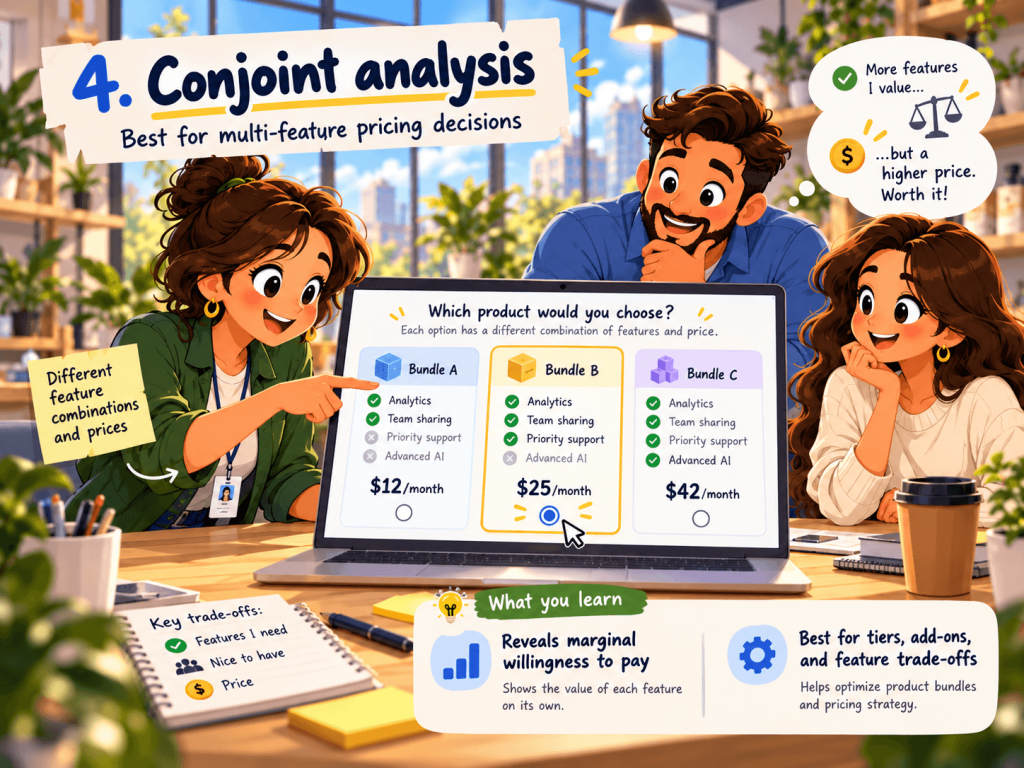
Conjoint analysis is the most realistic and the most demanding of the four. Rather than asking about price directly, it presents respondents with a series of product configurations, different bundles of features at different prices, and asks them to choose between them, the way they would in a real buying decision.
Because people are forced to trade features against price repeatedly, you can statistically pull apart how much each feature and each price level actually drives choice. The output is marginal WTP: how much a specific feature, integration, or tier is worth to a given segment, and how price interacts with all of it. If you are deciding what to put behind the next pricing tier, or what an add-on should cost, this is the method built for the job. It also handles competitive context better, because you can put rival-style options into the choice sets.
Where it breaks: complexity and cost. Conjoint needs a careful study design, a larger sample to reach statistical significance, and more analytical horsepower to interpret. Stated choices also still overshoot real ones: the same meta-analysis found indirect methods like conjoint overshoot by about ten points more than direct questions. It is overkill for “what should this one product cost” and exactly right for “how should we structure and price a multi-tier lineup.” Reach for it when the pricing decision is genuinely multi-dimensional and the stakes justify the effort.
Which method to use?
| Method | What you ask | What you get | Sample needed | Best for | Main weakness |
|---|---|---|---|---|---|
| Direct question | “What would you pay?” | A rough ballpark | Low | Early, order-of-magnitude read | People overstate; not decision-grade |
| Van Westendorp | Four price-perception questions | Acceptable price range + optimal point | ~100+ per segment | A single product’s price band | Weak for brand-new products; no clean point in some data |
| Gabor-Granger | “Would you buy at $X?” up and down a ladder | Demand curve + revenue-maximizing price | Moderate | Finding the revenue-max price | Prices in isolation from competitors |
| Conjoint | Choose between feature/price bundles | Marginal WTP per feature; tier design | High | Multi-tier and add-on pricing | Complex, costly, slower to field |
The strongest pricing work rarely relies on one method. A common pattern is to pair a Van Westendorp or Gabor-Granger question with a conjoint study, so you get both a price range and the feature-level detail behind it. Triangulating two methods that fail in different ways beats trusting one that fails silently.
Sample Size and Segmentation
A pricing survey lives or dies on who answered it, not how clever the method was.
Start with the sample size. For a Van Westendorp study, a common working minimum is around 100 completed responses per segment you intend to analyze. If you plan to compare enterprise buyers against SMB buyers, that is roughly 100 each, not 100 total split between them. Gabor-Granger and, especially, conjoint want more because you are estimating more parameters. Undershoot and the curves get noisy enough that the intersections move depending on which handful of people responded.
Then screen for reality. A price ceiling from someone who would never buy your product is noise dressed up as data. Use qualifying questions to keep the sample to people with real purchase intent or category experience, the same discipline you would apply to any study where survey response rates and respondent quality shape whether the numbers mean anything.
Finally, segment on purpose. Because WTP is a segment-level property, the whole point is to cut the results by the dimensions that predict a different ceiling: company size, plan tier, industry, use case, and region. An average across all of them describes a customer who does not exist and prices for nobody in particular. Set quotas up front so each segment you care about clears the sample-size bar.
Read Willingness to Pay From the Feedback You Already Have
Here is the part almost every WTP guide skips: you do not have to start from a blank commissioned study. If you are already running surveys and reading support tickets, you are sitting on a continuous, free WTP signal. It will not replace a formal study, but it will tell you where to start, and it updates every week instead of once a year.
Four places to look, using the customer feedback you already collect:
- Satisfaction scores cut by plan tier. Break Net Promoter Score and CSAT out by pricing tier and look for divergence. When Detractors cluster in one tier, you often have a value-to-price mismatch there: either the price has outran the value, or the tier is starving people of something they would happily pay for. A tier with strong scores and heavy usage, by contrast, is frequently underpriced relative to what it delivers.
- Feature-request patterns. What customers repeatedly ask for is a map of what they value, and value is the raw material of WTP. A feature requested constantly by your enterprise segment is a candidate for a higher tier or an add-on, not the free plan. The requests are effectively an unstructured conjoint study you are already running.
- Price mentions in open-ended answers. Comb your open-ended feedback for the language of price: “too expensive,” “worth every penny,” “cheaper than,” “hard to justify.” The frequency and sentiment of those mentions, tracked over time and by segment, is a live pressure gauge. A rising share of “too expensive” from a segment that used to call it a bargain is a warning that your ceiling is closer than you thought.
- Downgrade and cancellation reasons. The reasons people give when they leave or move to a cheaper plan are the closest thing you have to a revealed WTP ceiling. Price-driven churn concentrated in one segment tells you exactly where the market’s tolerance ends, without a survey at all.
None of this is precise enough to set a price on its own. What it does is turn pricing from a once-a-year event into something you monitor continuously, so that when you do run a Van Westendorp or conjoint study, you already know which segment and which question to target.
Turning WTP Data Into a Pricing Decision
Measuring willingness to pay is the input, not the answer. A few principles keep the output honest.
Treat the result as a range and pick a point inside it on purpose. Van Westendorp hands you a band and Gabor-Granger hands you a revenue peak, but where you land also depends on strategy: penetration and share, or margin and positioning. The data narrows the choice; it does not make it for you.
Triangulate before you commit. If two methods, or a method plus your existing feedback signal, point at roughly the same place, you can move with confidence. When they disagree, that disagreement is information about which segment or assumption is shaky.
Then test on a cohort rather than flipping the switch for everyone. Roll a new price out to new customers or a single segment first and watch conversion and, just as importantly, retention. A price that wins the sale but raises churn three months later has not actually raised your customer lifetime value; it has just moved the loss downstream. WTP tells you what people will pay to start. Retention tells you whether the price was fair enough to keep them.
If you are pricing something genuinely new with no reference point, product-market fit surveys are a useful companion read: strong fit signals give you the room to price on value, while weak fit means a pricing study is measuring a ceiling that has not formed yet.
Conclusion
A price set on instinct is a bet you never checked. Willingness to pay turns that bet into a measurement, and the methods to take it are well established: Van Westendorp for the acceptable band, Gabor-Granger for the profit peak, and conjoint for what each feature is actually worth. Match the method to the decision, respect the sample-size and segmentation rules, and read each result as a range rather than a verdict.
The cheapest place to start is the data already flowing past you. The satisfaction scores, feature requests, and cancellation reasons you collect today point to where your WTP sits by segment, and they keep pointing as the market moves. Use that signal to aim a proper study, then test any new price on a cohort and watch retention, not just conversion, before you roll it out.
Retently helps you collect and segment that signal, with NPS, CSAT, and open-ended feedback broken out by the customer attributes that predict what people will pay. Start a free trial to see where your customers actually stand, or book a demo to walk through it with our team.
Frequently Asked Questions
How is willingness to pay calculated? WTP is not calculated from a formula; it is measured. You survey a representative sample using a structured method, most commonly Van Westendorp’s Price Sensitivity Meter for an acceptable price range, Gabor-Granger for a revenue-maximizing price, or conjoint analysis for feature-level value, then read the price points off the resulting curves. Direct “what would you pay” questions give a rough starting figure but tend to overstate real WTP.
What affects willingness to pay? The main drivers are perceived value, available alternatives, brand trust, urgency or scarcity, and the buyer’s budget. Context matters too: the same person pays more when the need is immediate, or substitutes are scarce. Because these vary by customer, WTP is best understood at the segment level (company size, use case, tier) rather than as a single market-wide number.
What is the difference between willingness to pay and willingness to accept? Willingness to pay is the most a buyer would give up to obtain something. Willingness to accept (WTA) is the least a person would take to give something up or tolerate something unwanted. They are two sides of the same trade, but they usually do not match: research on the endowment effect finds people demand more to part with a good than they would pay to acquire it. For pricing a product you sell, WTP is the relevant measure.

 Christina Sol