



Open a modern helpdesk and it will happily track forty numbers for you. First response time by channel, by agent, by hour of day. Resolution time, handle time, reopen rate, CSAT, backlog age, tickets per agent, deflection. The dashboard isn’t the problem. The problem is that most support teams watch a dozen of these at once, act on almost none, and quietly optimize the two that are easiest to move.
That matters more than it used to. Zendesk’s CX Trends 2026 report found that 86% of consumers say responsiveness and accurate resolution highly influence their purchase decisions. Service speed and quality now sit close to the product itself in the buying decision, which makes the numbers you run a support desk on, indirectly, revenue numbers.
So this isn’t another list of fifteen metrics to add to the pile. It’s a smaller set, grouped by the question each one answers, with the trap that comes attached. Every support metric can be gamed, and most lie to you in a specific, predictable way. Knowing the trap is what separates a scorecard you can trust from a dashboard nobody acts on.
Key Takeaways
- Group metrics by the question each answers – speed, quality, effort, loyalty, load – not as a flat list. It collapses duplicates and exposes blind spots.
- Every metric has a trap: FRT gamed by autoresponders, FCR by premature closes, handle time by rushing, deflection by customers who quietly gave up. The trap is what makes the number trustworthy.
- Pair every operational metric with an experience one (FRT with CSAT, resolution time with reopen rate) so speed never wins at quality’s expense.
- Keep the scope to a SaaS or ecommerce support desk. Call-center metrics like occupancy and average speed of answer belong to a phone queue.
- A lean scorecard a team acts on beats a fifteen-metric dashboard nobody opens.
What customer service metrics actually measure (and what this guide leaves out)
A customer service metric is any number describing how your support operation runs or how customers feel about it. Almost every guide splits them into operational metrics (how the desk performs) and experience metrics (how the interaction felt). It’s a fine distinction, yet not the most useful one.
The more practical cut is to ask what question a metric answers. A support desk really only asks five. How fast are we? Are we actually fixing things? How hard is this for the customer? Do they feel good enough to stay? And how much is coming at us? Group your metrics that way and duplicates collapse (you don’t need three speed numbers), while blind spots that a flat list hides start to surface.
One scope note first. This is a dashboard for a SaaS or ecommerce team working tickets, chats, and emails, not a call-center scorecard. Average speed of answer, occupancy, schedule adherence, cost per minute of handle time: those belong to a contact center with live phone queues, not a ten-person support team. The whole thing sits underneath a broader CX management strategy, but stays on the support desk itself.
Speed: How fast do we respond and resolve?
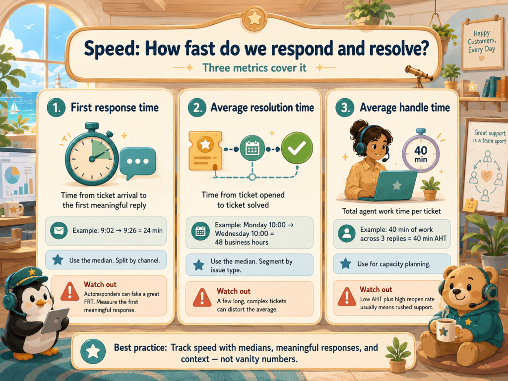
Speed is the first thing customers notice and the easiest thing to measure, which is why it’s the most over-tracked corner of the dashboard. Three numbers cover it.
First response time
First response time (FRT) is the gap between a ticket arriving and the customer getting a reply. Use the median, not the mean, and split it by channel. A ticket in at 9:02 with a human reply at 9:26 has a 24-minute FRT.
The trap: an automated “Thanks, we got your message” reply resets the clock without helping anyone. Desks post gorgeous FRT numbers built on autoresponders while the customer waits three hours for a real answer. Measure first meaningful response, the first time a human or a genuinely resolving AI agent moves the ticket forward.
Average resolution time
Resolution time is the full arc, from ticket opened to ticket solved. A ticket opened Monday at 10:00 and closed Wednesday at 10:00 is forty-eight hours (yet, count business hours only, so nights and weekends don’t inflate it).
The trap: a few monster tickets wreck the average. One integration bug that takes nine days can double your weekly mean and make a fast team look slow. Use the median, and segment by issue type so a password reset and a billing dispute aren’t averaged together.
Average handle time
Average handle time (AHT) is the working time an agent spends on a ticket, across every reply, divided by the number of tickets. Forty minutes of work over three replies is forty minutes of handle time.
The trap: the classic perverse incentive. Target AHT and you reward rushing, early closes, and second contacts customers wouldn’t have needed. A falling AHT next to a rising reopen rate isn’t efficiency; it’s the same problem handled twice. Use it for capacity planning, never as a goal on its own.
Quality: Are we actually solving the problem?
Speed without resolution is just fast disappointment. The quality bucket asks whether the work stuck.
First contact resolution
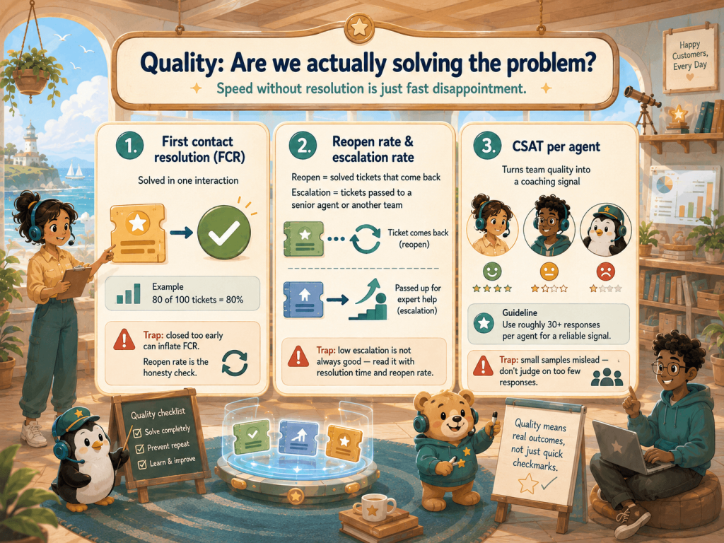
First contact resolution (FCR) is the share of tickets solved in one interaction, no follow-up needed. 80 of 100 tickets closed without the customer coming back is 80% FCR, one of the strongest single signals of a healthy desk.
The trap: FCR is easy to inflate. Close a ticket the moment you reply and it counts, even if the customer reopens it an hour later furious that nothing was fixed. Some desks even log the reopened ticket as brand new. FCR only tells the truth when paired with the reopen rate.
Reopen rate and escalation rate
Reopen rate is the share of resolved tickets that come back: 12 reopens against 200 resolved tickets is 6%. It’s the honesty check on FCR. Escalation rate, the share bumped to a senior agent or another team, shows how much the frontline handles alone.
The trap: a low escalation rate reads like good news and sometimes isn’t. It can mean a capable frontline, or agents afraid to escalate who sit on tickets they can’t solve. Read it next to resolution time and reopen rate before deciding which story you’re in.
CSAT per agent
Breaking out CSAT (Customer Satisfaction Score) by agent turns a team metric into a coaching signal: consistently below the team is worth a conversation, consistently above is worth learning from.
The trap: small samples lie. Six responses in a month can make an agent look like a star or a liability on pure noise, and ranking a team on numbers that thin invites cherry-picking (closing easy tickets, timing the survey after a win). Don’t rank on fewer than roughly thirty responses, and never use per-agent CSAT as a stick, or agents start gaming who gets surveyed.
Effort: How hard did we make the customer work?
Satisfaction tells you whether a customer was happy. Effort tells you what it cost them to get there, and it’s often the better predictor of whether they stay.
Customer effort score
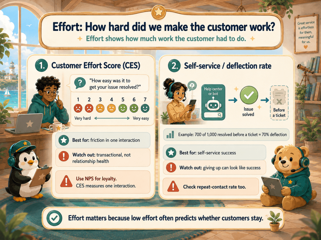
Customer Effort Score (CES) asks how much work an interaction took, usually one question after a resolution (“How easy was it to get your issue resolved?”) on an agree-to-disagree scale. It catches friction a satisfaction score glosses over, which is why it sits next to CSAT on most support scorecards.
The trap: CES is transactional by design. It measures one interaction, not the health of the relationship, so it’s a poor proxy for loyalty on its own. A customer can breeze through an easy chat and still be quietly shopping for a replacement. Reading the relationship is Net Promoter Score’s job, below.
Self-service and deflection rate
Deflection rate is the share of questions resolved before they ever become a ticket, when someone finds the answer in your help center or from a bot. Of 1,000 help-center sessions that could have become tickets, 700 ending without one is 70% deflection.
The trap: a customer who gives up looks identical to one who got helped. Both leave without a ticket, so both count as “deflected.” Watch it alongside repeat-contact rate: if deflection climbs while the same customers keep coming back on the same issues, you’re delaying problems, not deflecting them.
Satisfaction and loyalty: How do they feel, and will they stay?
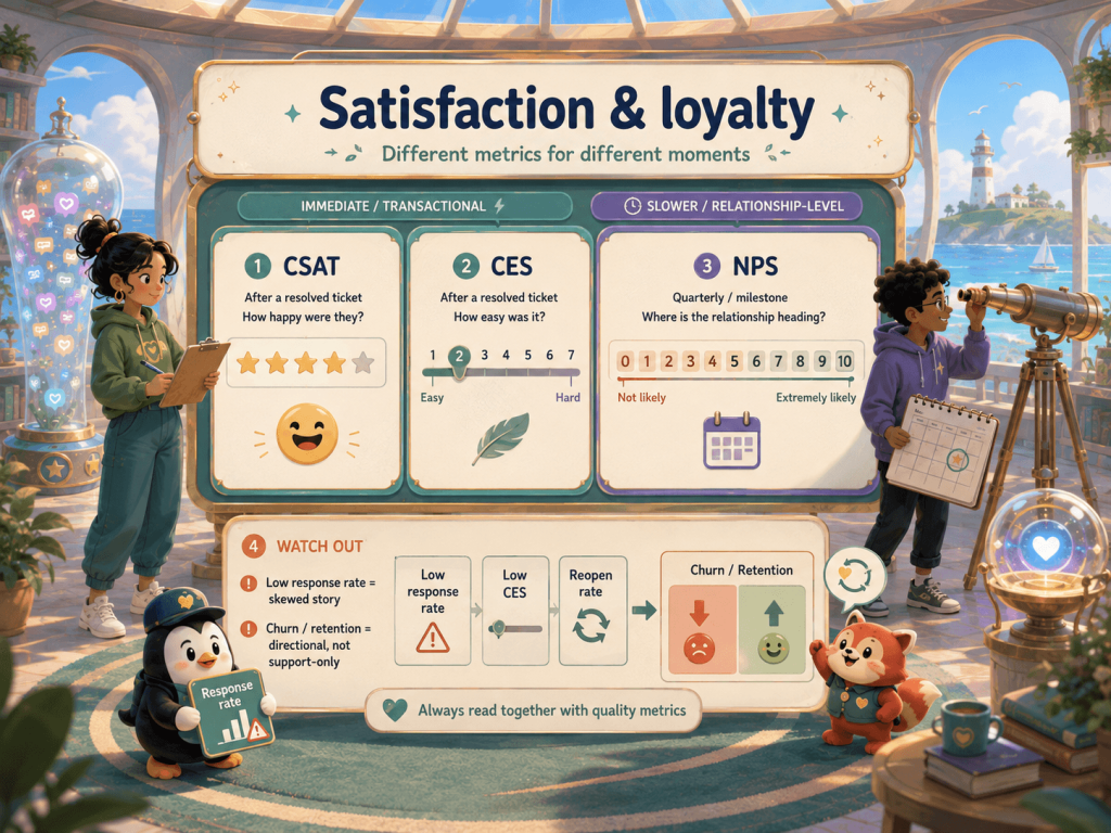
This bucket is where three metrics people treat as interchangeable each earn a separate line. CSAT tells you whether a single interaction landed. CES tells you how much effort it took. NPS tells you where the relationship is heading. They fire at different moments, which is why a scorecard wants all three, not a favorite.
CSAT and CES both fire right after a resolved ticket, one asking about happiness, the other about effort. NPS steps back from any single ticket and reads the whole relationship on a slower clock, so it belongs on a quarterly or milestone cadence, not stapled to every reply. We cover the deep definitions in the guide to NPS, CSAT and CES and what a healthy score looks like in the NPS benchmarks guide, so there’s no need to rebuild them here.
The trap that catches all three: none of them work if nobody answers. A CSAT of 92% built on a 3% response rate is a story about your happiest, loudest customers, not your customer base. Watch response rate as closely as the score.
Churn and retention
Churn and retention are the metrics support influences but doesn’t own. Good service keeps people and bad service pushes them out, but a customer also churns because a competitor got cheaper, a budget got cut, or the product missed a feature that support never touched.
The trap: support gets blamed and credited for churn it can only partly move. Treat retention as a directional signal, not a support KPI you can pull on demand. Correlate it with the quality metrics you can control: if accounts with high reopen rates and low CES churn faster than the rest, now you have a support problem worth fixing.
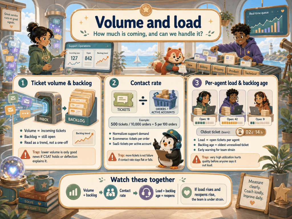
Volume and load: How much is coming, and can we handle it?
The last question is operational reality: what’s the incoming load, and can the team clear it without burning out. Three numbers again.
Ticket volume and backlog
Ticket volume is the raw count of incoming tickets; backlog is what’s still open and waiting. Both work better as a trend than an absolute. A jump the week after a release points at the release, and a backlog growing day over day means you’re taking on more than you close.
The trap: falling volume feels like a win and sometimes isn’t. Fewer tickets can mean fewer problems, or that customers gave up and are churning quietly. A volume drop is only good news if CSAT holds and deflection explains the gap. Read it next to those two, never alone.
Contact rate
Raw ticket count grows with the business, which makes it useless for judging efficiency. Contact rate fixes that by normalizing volume against something that scales with you: tickets per order for ecommerce, tickets per active account for SaaS. Five hundred tickets against 10,000 orders is five per hundred orders, comparable month to month, even as you grow.
The trap: absolute volume climbing isn’t failure if the contact rate is flat or falling. More tickets because you have more customers is fine. More tickets per customer is the number that says something broke.
Per-agent load and backlog age
Per-agent load (open tickets divided by available agents) and backlog age (how long the oldest unresolved tickets have sat) are your early warning for team strain. Backlog age is especially honest: averages hide the ticket rotting for two weeks, but the oldest-ticket age doesn’t.
The trap: pushing utilization too high looks efficient right up until it isn’t. Load an agent to 100% and quality slips first, through rushed replies and more reopens, long before anyone complains. High utilization next to a climbing reopen rate is a team about to break.
Building a support scorecard that holds up
Here’s the payoff of grouping by question instead of by list: you don’t need every metric above. You need one strong one per question, and a rule that keeps them honest.
Pick a primary metric for each of the five questions. One speed metric (median FRT by channel). One quality metric (FCR paired with reopen rate). One effort metric (CES). One loyalty pairing (CSAT after tickets, NPS on a slower cadence). One load metric (contact rate). That’s a five-line scorecard a team can read in a Monday standup and act on by Friday. A fifteen-metric dashboard is where accountability hides: when everything is tracked, nothing is owned.
The rule that ties it together: pair every operational metric with an experience one, so speed never wins at quality’s expense. FRT next to CSAT. Resolution time next to reopen rate. AHT next to FCR. Left alone, an operational number gets optimized in isolation, and you ship a desk that’s fast, cheap, and quietly making customers miserable. It’s the same logic behind reading support numbers alongside engagement metrics, the usage and adoption signals that tell you whether customers are getting value at all, not just whether their last ticket went well.
How to actually measure these
The five buckets come from two sources. Your helpdesk (Zendesk, Gorgias, Intercom, Help Scout, whatever you run) already tracks the operational numbers: FRT, resolution time, AHT, FCR, volume, backlog, and per-agent load. The work is choosing which few to watch, not collecting them.
The experience numbers (CSAT, CES, NPS) you have to ask for, and timing is everything. Trigger CSAT and CES automatically right after a ticket resolves, and run NPS on a relationship cadence. What you ask matters as much as when: our guide to service survey questions covers the wording that gets usable answers instead of shrugs. This is the layer Retently handles, collecting CSAT, CES, and NPS off your support events and routing low scores to someone who can act, wired into the helpdesk you already run.
Then the numbers have to go somewhere. A metric you watch but never act on is a more sophisticated way of doing nothing. Once your scorecard points at a problem, like reopens climbing or CES sliding on one issue type, the next move is fixing the service itself, which is where our practical plays to improve service pick up.
A smaller scorecard, honestly read
Most support teams don’t struggle because they track too few metrics. They struggle because they track too many, act on almost none, and misread the ones they watch because nobody flagged the trap inside each number. The metrics don’t lie on their own, but they’ll let you lie to yourself.
The fix isn’t a bigger dashboard. It’s five questions, one trustworthy metric each, an experience metric paired to every operational one, and the discipline to act on what they show. Get that right and your support numbers stop being a report card nobody reads and start being an early warning for the revenue that responsiveness and resolution quietly drive.
Retently is the measurement and closed-loop layer for the experience half of that scorecard: CSAT, CES, and NPS collected off your support events, sentiment on the comments, and low scores routed to someone who can fix them. Start a free trial to see where your customers actually stand, or book a demo to walk through it with us.
Frequently Asked Questions
What are the most important customer service metrics? There’s no universal top five, but the useful frame is one metric per question your desk answers: first response time for speed, first contact resolution for quality, Customer Effort Score for effort, CSAT and NPS for satisfaction and loyalty, and contact rate for load. One strong metric per question beats fifteen you never act on.
How do you measure customer service performance? With a scorecard, not a single number. Pull the operational metrics (speed, resolution, volume) from your helpdesk, collect the experience metrics (CSAT, CES, NPS) through surveys triggered at the right moment, and pair every operational metric with an experience one so speed never gets optimized at quality’s expense. Performance is the pattern across them, not any one reading.
What’s the difference between a customer service metric and a KPI? A metric is any number you can measure; a KPI is the small set you’ve decided actually indicates success and hold the team to. Every KPI is a metric, but most metrics shouldn’t be KPIs. The point of a scorecard is demoting most of your metrics to context and promoting a handful to KPIs.
What’s a good first response time or FCR? There’s no single benchmark that travels, and treating one as gospel is how these numbers start lying to you. A good FRT for live chat is measured in minutes; over email, customers expect to wait considerably longer. FCR expectations swing by issue complexity. Set your own baseline from your trailing median, then work to beat yourself rather than chase a figure from someone else’s channel mix.
Which customer service metrics are vanity metrics? Any metric can turn vanity when it’s watched in isolation or set as a target. The usual offenders: average handle time as a performance goal (rewards rushing), raw ticket volume with no denominator (grows with the business, says nothing about efficiency), and deflection rate on its own (a customer who gave up looks exactly like one who got helped).

 Christina Sol