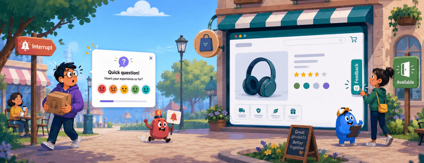



Somewhere on your site right now, there’s a page where you’d genuinely like to hear from visitors. You have two mechanisms for it. You can show a survey: it appears at a moment you choose, asks its question, and gets an answer or a dismissal. Or you can place a small control in the corner of the page that does nothing at all until a visitor decides to use it.
Most teams treat these as two skins of the same feature. Same widget, different trigger. They’re not. A popup survey decides the moment on the customer’s behalf. A feedback button hands that decision to the customer. That single difference determines who you should target, how often you should ask, what counts as abuse, and what you’ll end up paying for.
It also explains the most common configuration mistake we see: teams set up a feedback button using the rules they learned from popup surveys. Cooldown periods. Hide-after-response. Thirty-day suppression windows. Settings that make an interrupting survey polite will quietly kill an always-available channel, and the dashboard won’t tell you why the volume died.
This piece walks through both models honestly. The interruption model is not the villain here; it’s the right tool for a whole class of jobs. The point is that the two models run on opposite rules, and knowing which rulebook you’re holding matters more than which widget you picked.
Key Takeaways
- A pop-up or triggered survey decides the feedback moment on the customer’s behalf. A feedback button hands that decision to the customer. Every other design choice follows from this difference.
- Because interruption has a real cost, popup surveys need frequency caps: new-contact grace periods, cooldowns between asks, and once-per-campaign rules.
- Those same caps destroy a feedback button. Hiding an always-available control after someone responds suppresses your most engaged reporters, and it prevents nothing, because a waiting button causes no fatigue in the first place.
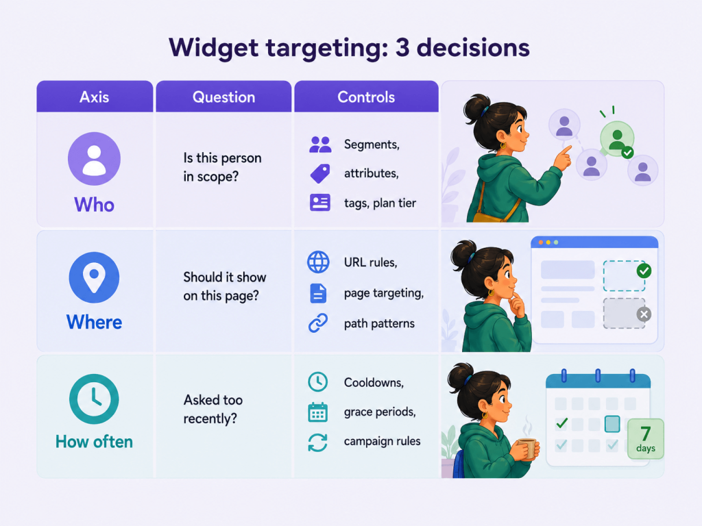
- Targeting has three axes: who sees it, where it appears, and how often it fires. Interruption channels need all three. Availability channels need the first two and should barely touch the third.
- Button feedback is self-selected. It’s excellent for catching problems and terrible for trending a metric. Run it alongside a sampled NPS or CSAT program, not instead of one.
The Interruption Model: Why Popup Surveys Have to Be Rationed
A triggered survey works like a scheduled knock on the door. You define an eligible audience, set a trigger (time on page, a completed checkout, a resolved support ticket, or simply a date), and the survey appears. The customer isn’t consulted about the timing. That’s not a flaw; it’s the entire design. You picked a moment that mattered to your business and asked while the experience was still fresh.
But because you chose the moment, you owe the customer restraint. This is why every mature in-app survey platform ships frequency controls: don’t survey a brand-new contact in their first couple of weeks, don’t let two campaigns hit the same person, don’t ask again within 30, 60, or 90 days of the last response. These settings aren’t bureaucratic clutter. They’re the tax you pay for interrupting, and paying it is what keeps the channel usable.
Skip the tax and you get fatigue, and fatigue is not hypothetical. The long-run evidence is grim across every solicited channel. Pew Research Center’s telephone polls fell to a 6% response rate back in 2018, down from around 9% a few years earlier. Even the U.S. government can’t escape the trend: Brookings reports that the Current Population Survey hit a 64% response rate in November 2025, its lowest in recent history, against the 70-80% that major federal surveys managed through the 2000s.
Customer surveys sit at the sharp end of the same curve. Our own analysis of over 25 million ecommerce surveys sent in 2025 found a full-year average response rate of 5.76%. And the fatigue mechanism showed up right inside the data: in Q4, when brands nearly doubled their sending volume for peak season, the response rate dropped to 4.03%. More asking, less answering. Some of the industry’s decline is self-inflicted by teams treating a survey impression as free.
Here’s the honest other half, though. Rationed properly, the interruption model buys you things no passive channel can.
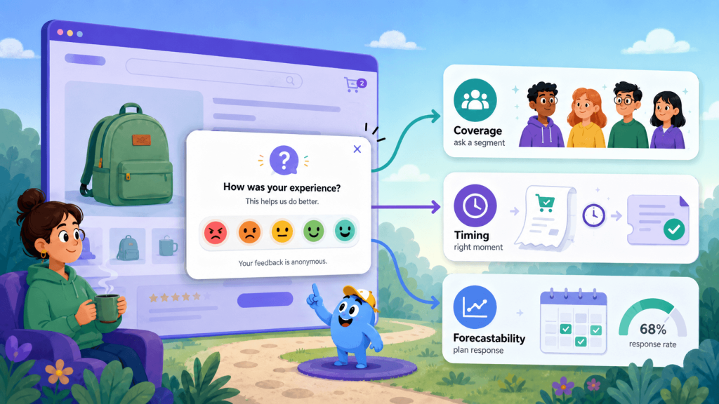
- Coverage: you can ask everyone in a segment, not only the people who feel like talking.
- Timing: you can catch the moment that matters, right after checkout or right after a ticket closes, and attribute the answer to it.
- Forecastability: a defined audience and a stable trigger produce a response rate you can plan around.
In the same 2025 dataset, in-app surveys shown to customers already active in the product averaged a 32.34% response rate, roughly ten times the email average. A well-timed ask, in context, still works remarkably well.
Interrupt, then, when the moment itself is the data. Just ration it like you mean it.
The Availability Model: Why Rationing a Feedback Button Backfires
A persistent feedback button is a different kind of object altogether. It’s an instrument, not an event. A survey fires; a button waits. It sits in the corner of the page holding a standing invitation: when you have something to tell us, here’s the door.
That changes what “protecting the customer” means, and this is where we’d argue a fair number of tools get it wrong. A common default is to hide or suppress the control for days after a visitor responds, on the logic that someone who just gave feedback shouldn’t be asked again. The logic sounds prudent. It’s transplanted straight from the popup world, where it genuinely is prudent.
Play it forward, though. A visitor uses your button on Monday to say the size guide is confusing. On Tuesday, your checkout breaks, and that same visitor hits the broken page. If the button vanished after Monday’s response, the one person on your site who has already proven willing to report problems now has no way to tell you. You didn’t protect them from anything. You silenced your most engaged reporter at the exact moment they had something urgent to say.
The deeper reason the transplant fails: survey fatigue is a function of unrequested interruptions. A popup costs the customer attention they didn’t offer, so each additional popup draws down a finite budget. A button in the corner asks for nothing. It never fires, never covers content, never demands a decision. Nobody has ever closed a browser tab because a quiet “Feedback” tab existed. There’s no fatigue to protect anyone from, so a cooldown has no benefit to weigh against its very real cost.
We’re not alone in this read. Nielsen Norman Group’s guidance on feedback requests recommends precisely this pattern: instead of interrupting with a popup, provide an always-accessible feedback mechanism, like a small tab on the side of the page, that users open when they’re ready. The user picks the moment; the quality of what they say goes up because they have something specific to say.
So the popup instinct (“cap the frequency, hide it after a response”) is a category error when applied to a button. The rule that protects the customer in one model destroys the channel in the other.
The one objection worth taking seriously is abuse. Yes, an always-available control can be spammed: a bored visitor, a stuck-key accident, a bot. But look at the shape of that problem. It’s a burst of submissions in a short window, and it has a matching answer: a short per-visitor burst cap, measured in minutes. Someone who submits five times in three minutes can politely be asked to take a breath. That stops the spammer cold and costs the Monday-Tuesday reporter nothing. Abuse is a volume problem with a volume answer. It is not a reason to make the door disappear for a week.
Who, Where, How Often: The Three Axes Teams Conflate
Most “widget targeting” screens mix three genuinely different questions into one pile of settings. Untangling them is the fastest way to configure both channels correctly.
| Axis | The question it answers | Typical controls |
|---|---|---|
| Who | Is this person in scope at all? | Segments, attributes, tags, plan tier |
| Where | Does this control belong on this page? | URL rules, page targeting, path patterns |
| How often | Have we asked this person too recently? | Cooldown windows, new-contact grace periods, once-per-campaign rules |
The thesis of this whole piece fits in one line: interruption channels need all three axes. Availability channels need who and where, and should leave how often almost entirely alone.
“Where” deserves more respect than it gets. Nearly every “the widget showed up somewhere embarrassing” complaint (on the checkout page, over the payment form, inside a legal document) is a page-rule problem, not a frequency problem. Google’s guidance on intrusive interstitials points the same direction from the SEO side: content-obscuring overlays can hurt search performance, while small banners that leave the content alone are explicitly fine. Good page rules solve the embarrassment; frequency caps never did.
Then there’s the anonymous-traffic reality. On a public marketing or storefront page, you know almost nothing about the visitor. No email, no plan, no history. The “who” axis can barely discriminate, so audience filters on anonymous traffic tend to collapse into one of two failure modes:
- they match everyone (so why have them), or
- they match nobody (and the control never renders).
We covered the identity problem in more depth when we looked at NPS for website visitors; the short version is that availability plus good page rules is the design that actually works on anonymous traffic. A button that’s simply present on the right pages will collect more useful signals than a popup aimed at targeting data you don’t have.
What Counts as “One Response”? Ask Before You Buy
Every feedback tool meters something because vendors have to bill on something. The models differ, and the differences are bigger than they look: some count sends (an invitation went out), some count views or displays (a survey rendered in front of a human), some count completed responses.
For scheduled email surveys, the distinctions barely matter – sends, opens, and responses sit in a predictable ratio you learn within a month. For an always-available control on a high-traffic public page, the metering model is suddenly the whole cost story.
Here’s the edge case almost nobody writes about. A curious visitor clicks your feedback button, glances at the panel, and closes it without typing a word. Was that a survey? Plenty of systems say yes: a survey was displayed to a human being, and that’s a defensible place to draw the line. But if you’re paying per display on a page with six figures of monthly traffic, curiosity clicks and drive-by opens become a real line item, while a responses-only meter prices the same page completely differently. Between the two models, the gap on high-traffic anonymous pages can reach an order of magnitude.
So, put two specific questions to any vendor, ours included, before you commit a feedback widget to a busy page:
- What happens on an abandoned open? A visitor opens the panel and leaves without submitting. Does the meter click?
- What happens on a repeat submission? The same visitor sends two pieces of feedback in one session. One count or two?
There’s no universally right answer, and this isn’t an accusation of trickery; each model is coherent. But you can’t build a cost model for an availability channel without knowing where the meter clicks, and the time to find out is before the widget ships, not on the first invoice.
Feedback Button or Popup Survey: A Decision Table
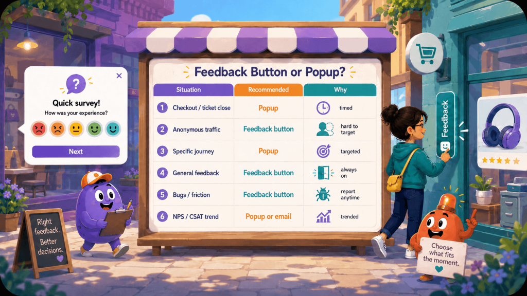
The easiest way to choose between the two is to ask what kind of feedback moment you’re dealing with. If the moment is known, targeted, and attributable, a triggered survey usually works better. If the moment is unknown, user-initiated, or hard to target, a feedback button is the safer channel.
| Situation | Use | Why |
|---|---|---|
| Post-transaction moment you control (checkout, ticket resolution) | Popup or triggered survey | You know the moment matters and you can attribute the response to it |
| Anonymous marketing or storefront traffic | Feedback button | You can’t target usefully and you don’t want to interrupt a stranger mid-task |
| Logged-in product, measuring a specific journey | Popup, tightly frequency-capped | Timing is the whole point, and you have identity to cap on |
| Logged-in product, general “tell us anything” channel | Feedback button, always visible | Availability is the point; hiding it defeats it |
| Bug and friction reports | Feedback button | The customer knows when something broke; you don’t |
| Tracking a metric over time (NPS, CSAT trend) | Popup or email, sampled | You need a comparable, sampled population, which self-selection can’t give you |
One caveat belongs right next to that table, and it’s the limit of our own argument. A feedback button’s data is self-selected. The people who click it are the ones with something to say, which makes it great for surfacing problems and useless for answering “is satisfaction trending up?” If you need a number you can compare quarter over quarter, you need a sampled program built on NPS or CSAT, where you choose who gets asked. Two instruments, two jobs. The button doesn’t replace the metric program, and the metric program will never catch Tuesday’s broken checkout page by itself.
Common Feedback Button Mistakes
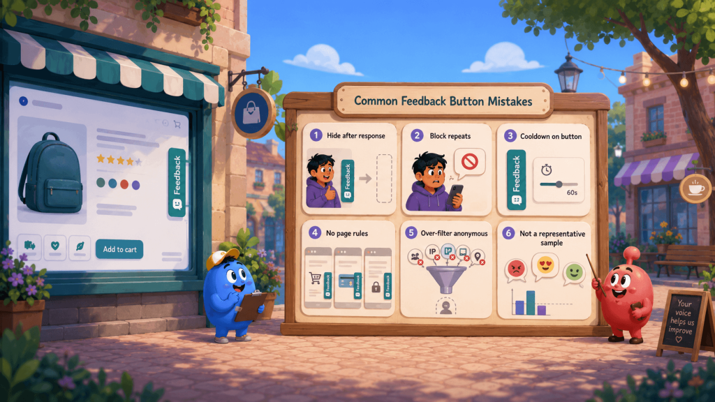
Here are the mistakes that usually turn a useful feedback button into a blocked, biased, or misread channel.
Hiding the button after a response. The whole argument above, restated as a checklist item. The visitor who reported yesterday is the most likely reporter of tomorrow’s problem. Suppress spam bursts, measured in minutes; never suppress availability, measured in days.
Treating repeat feedback as abuse. A visitor who files two separate reports in one session isn’t gaming anything. They found two things. That’s your most valuable user this month, and a dedupe-happy pipeline that collapses or blocks them is throwing away exactly the signal the channel exists to catch.
Copying in-app frequency settings onto the button because the settings screen offered them. An empty cooldown field looks like an oversight, so people fill it in. Resist the urge. If a control never interrupts, a cooldown protects no one; it only closes the door at random.
Shipping with no page rules. The button lands on checkout, on the payment form, over your terms of service. Every one of those is a “where” decision you didn’t make. Decide it before launch: exclude conversion-critical and legally sensitive pages, then let the button be boring everywhere else.
Over-filtering anonymous traffic. Stacking audience conditions that anonymous visitors can never satisfy, so the control renders for nobody, and then concluding “feedback buttons don’t work for us.” The audience axis barely functions without identity. Who and where lightly, how often not at all.
Reading button feedback as a representative sample. Twelve complaints about pricing through the button doesn’t mean pricing is your customers’ top issue; it means twelve motivated people had pricing on their mind. Route button feedback to triage and product review, and keep your trend charts fed by the sampled program.
The Accessibility Bar for a Floating Control
A persistent button is a permanent part of your page, so it has to clear the same accessibility bar as your navigation, and WCAG 2.2 raised that bar in ways floating widgets often fail. Two Level AA criteria are directly on point.
- Target Size (Minimum) requires pointer targets of at least 24 by 24 CSS pixels, which a fashionably minimal corner tab can miss; users with tremors or limited dexterity, and anyone on a phone held one-handed, are the ones who pay for the slim look.
- And Focus Not Obscured (Minimum) says author-created content must not entirely hide the element that has keyboard focus, a rule sticky, floating elements are the canonical way to break.
Make the button reachable by keyboard in a sensible order, keep it from covering focused controls or page content on small screens, and give it a real accessible name. A control that waits for the customer should be usable by every customer who comes looking for it.
Conclusion: Ration What Interrupts, Never Ration What Waits
Strip everything else away and one question separates the two models: who picks the moment? When you pick it, you’re spending the customer’s attention, so spend it sparingly, at moments worth the interruption, behind sensible frequency caps. When the customer picks it, your job flips: be reliably, boringly present, on the right pages, for everyone, always.
That’s the operating rule worth pinning above the widget settings: ration what interrupts, and never ration what waits. Retently ships both models: triggered in-app surveys with the frequency controls the interruption model demands, and a persistent Feedback Button built to stay available. If your survey volume is climbing while responses fall, our survey response rate guide is a practical place to start rebalancing.

 Christina Sol